Product rendering
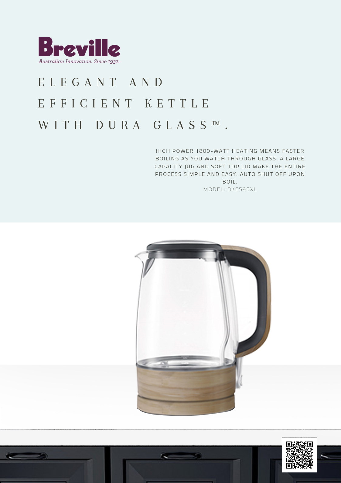
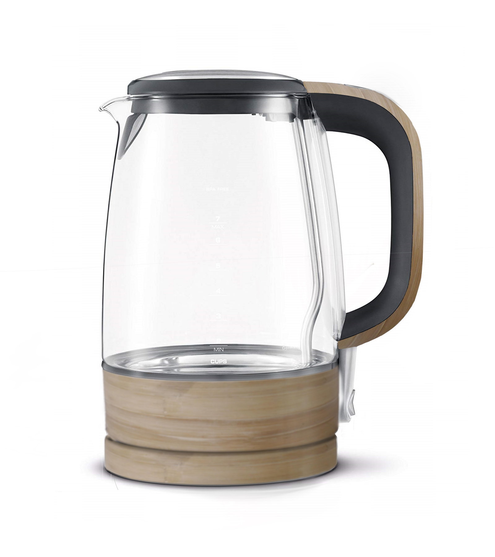
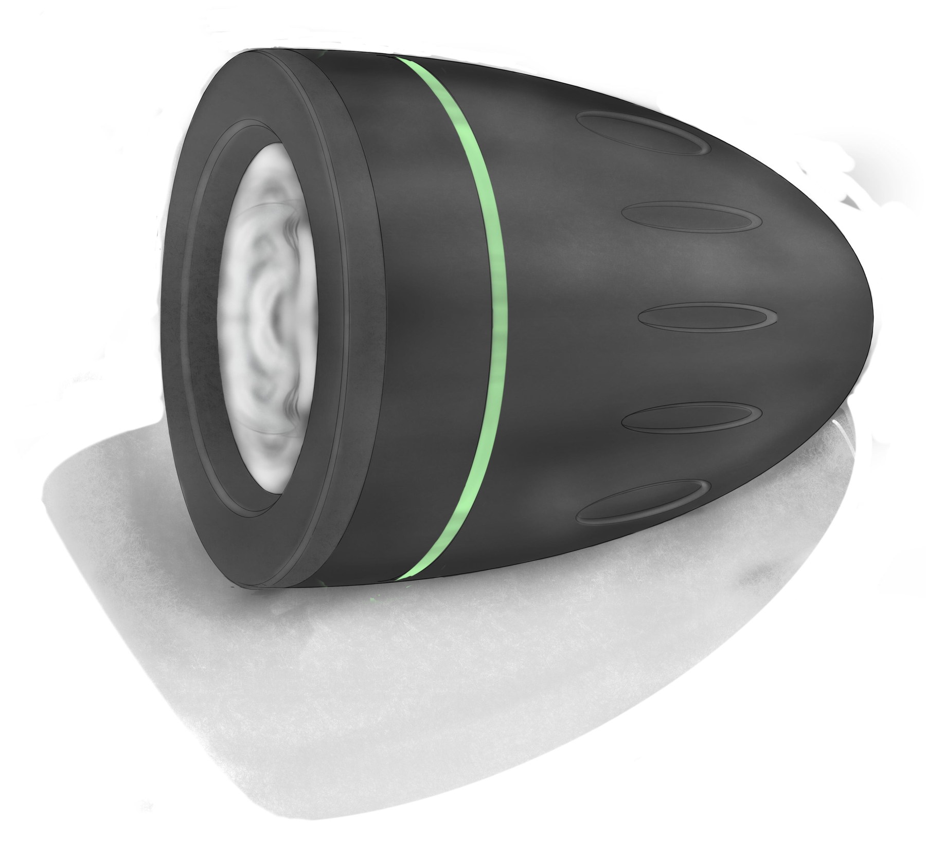
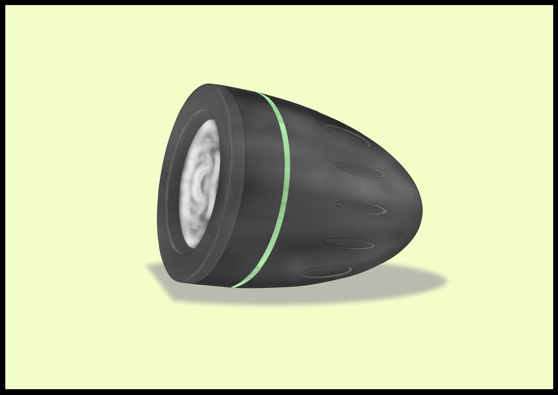
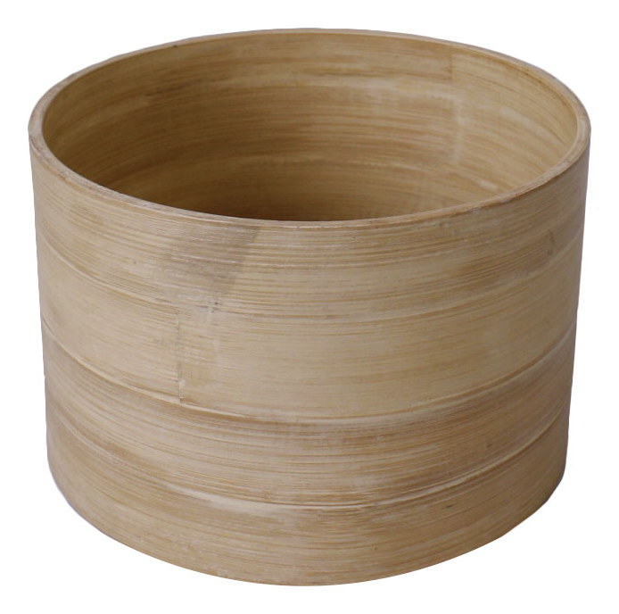
A module on making a thing that does not exist look like a photograph of a thing that does. Existing products — a glass kettle, a torch, a turned bowl — modelled and rendered until the glass, the brushed metal and the contact shadow stopped giving it away.
// Why this exists
The companion to drawing by hand. Where the visualisation module taught what light does, this one taught how to make software do it — and the honest framing matters here: these are renderings of products that already exist, built to learn the craft. None of these objects is my design, and the exercise was never to invent one.
// What actually happened
Model the object from reference, then spend most of the time on everything that is not the object: the lighting rig, the material definitions, the ground plane, the falloff of the shadow. A glass kettle is the useful test case because it fails in three ways at once — refraction through the body, a caustic on the surface under it, and a wood base that has to read as matte in the same frame.
// What was delivered
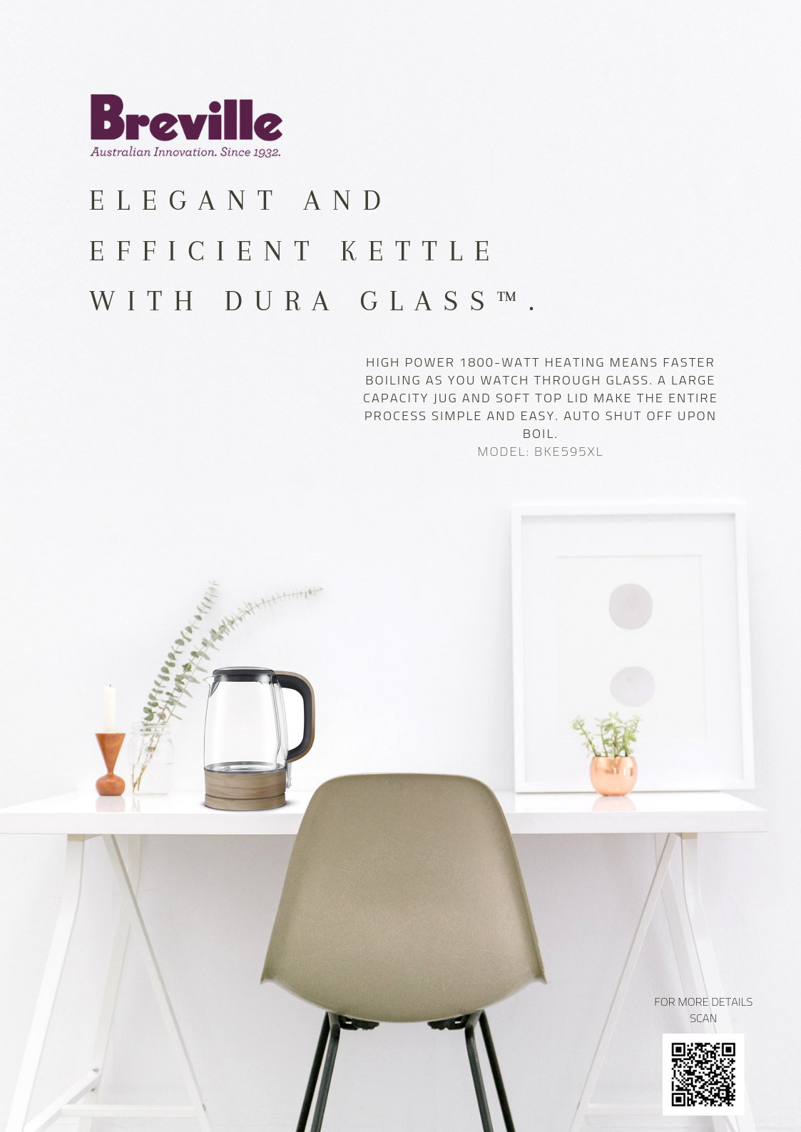
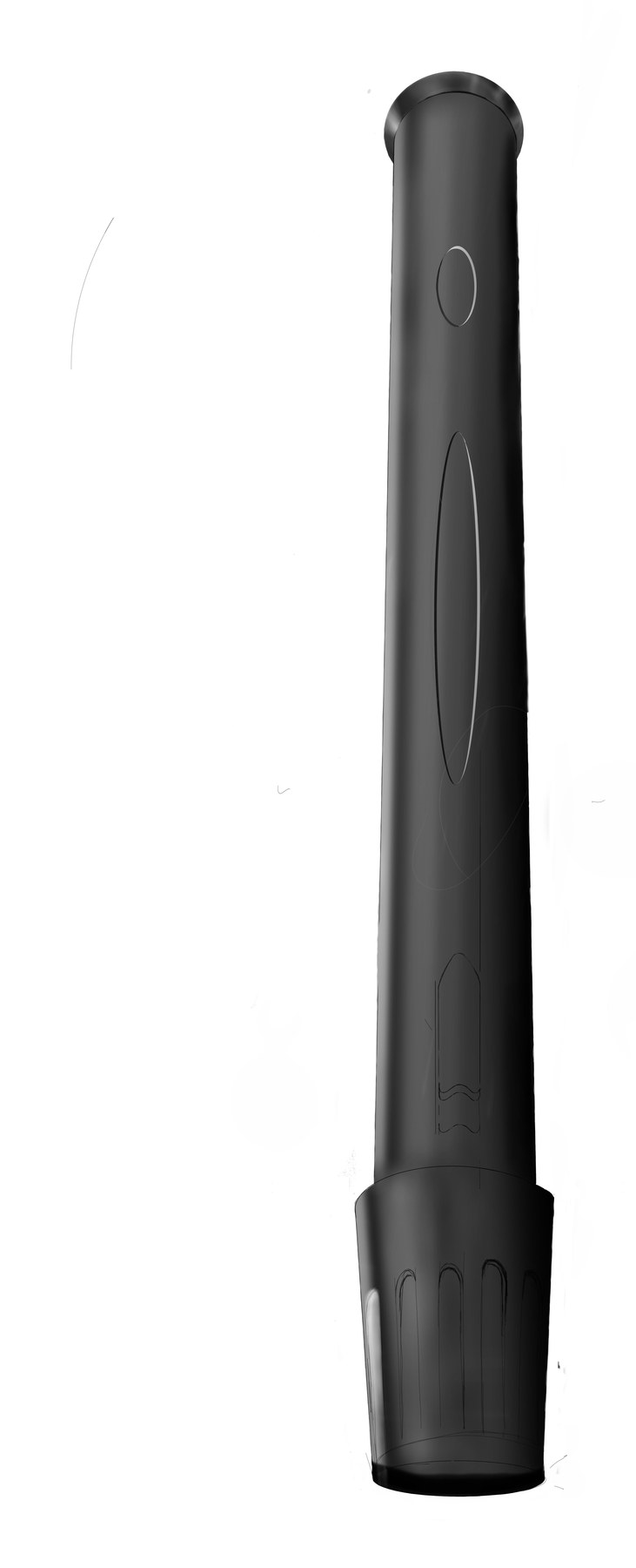
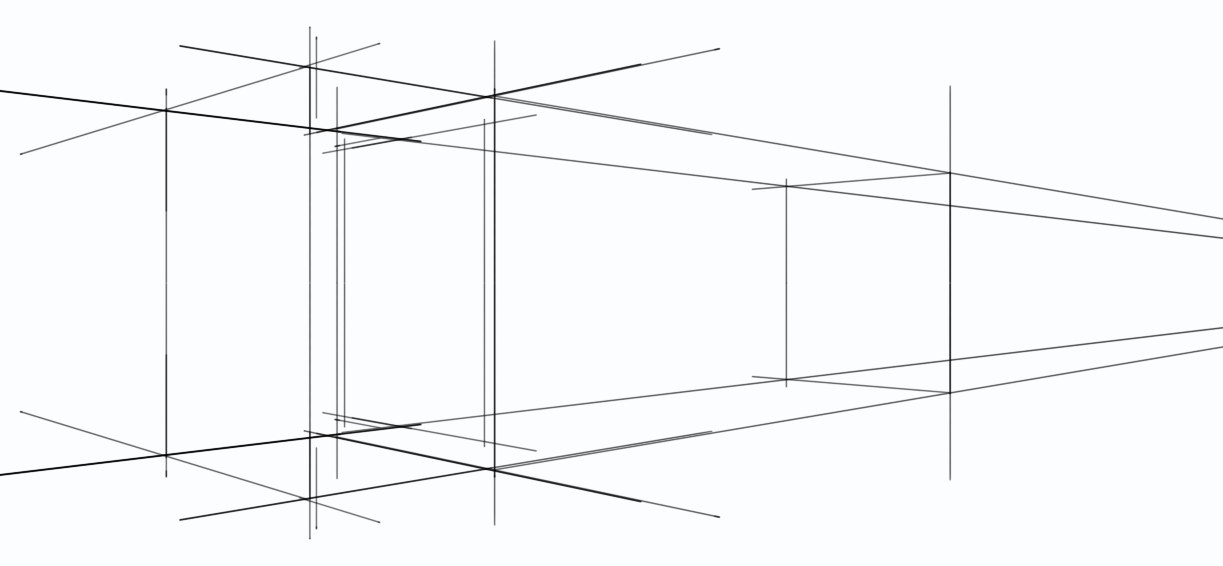
Two poster layouts rebuilt around the kettle render, plus finished renderings of the kettle in studio, a torch in studio and on a colour ground, a baton form, a turned bowl, and the construction views underneath them.
// What I did
My own renders only. Several files in this folder are a classmate's and are not on this page.
// What came out of it
The poster is the real test and the reason the project exists: a render only has to survive on a white plate, but drop it into a photographed kitchen next to a real counter and real cabinets and every wrong reflection shows. The thing that improved fastest was patience with the lighting rather than skill with the modelling — most of what separates a flat render from a convincing one happens after the geometry is finished, and almost all of it is the shadow where the object meets the ground.
// Where it stands now
A finished module. Nothing here was made or sold; they are studies.
// What I'd do differently now
- I spent the early weeks improving the model when the render was being let down by the lighting. Geometry is the part you can see yourself doing, which is exactly why it absorbs time it does not deserve.
- These are renderings of other people's products and I did not label them that way at the time. On a portfolio that distinction is the whole difference between a craft exercise and a false claim, so the page states it plainly.