Nashik Kumbh Mela 2027 — logo competition
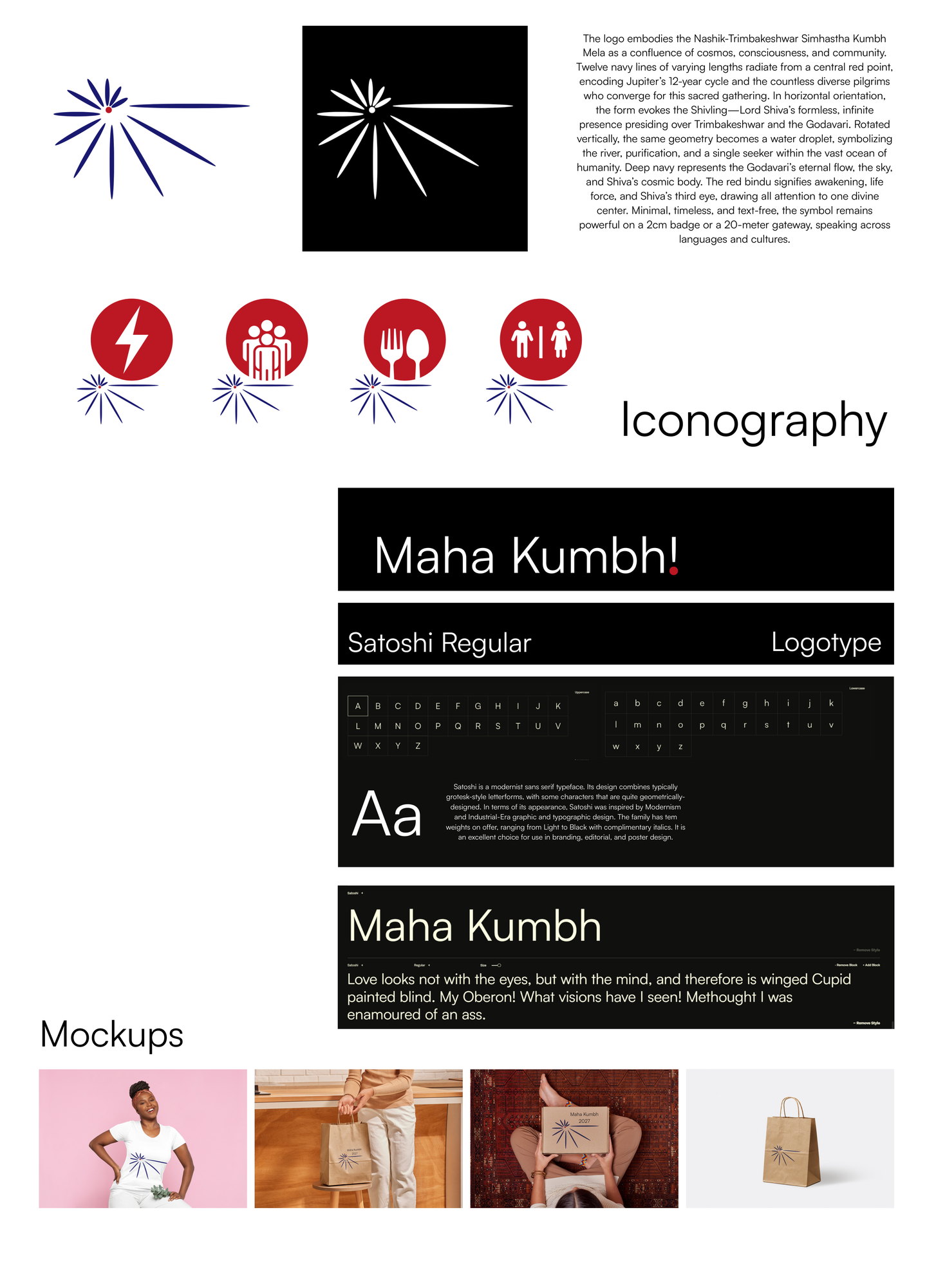
An open competition entry for the identity of the Nashik-Trimbakeshwar Simhastha Kumbh Mela: twelve navy lines radiating from a red point, readable as a shivling one way and a water droplet the other, with a wayfinding set built from the same geometry.
// Why this exists
A public competition run for the 2027 Simhastha Kumbh Mela at Nashik and Trimbakeshwar — one of the largest gatherings of people anywhere, and a mark that has to work on a volunteer's badge and on a gateway twenty metres across, for pilgrims who between them read a dozen scripts. That last constraint does most of the designing: anything that depends on a word is already failing.
// What actually happened
The symbol is twelve navy lines of different lengths radiating from a single red point. Twelve for Jupiter's twelve-year cycle, which is what sets the festival's timing, and different lengths for the fact that the people arriving are not uniform. Laid horizontally the radiating form reads as a shivling, for Trimbakeshwar and the Shiva association. Turned vertical, the same geometry reads as a falling droplet, for the Godavari and for one person inside an ocean of people. Navy carries the river, the night sky and Shiva's cosmic body; the red bindu is the third eye and the point everything converges on. No text at all.

// What was delivered
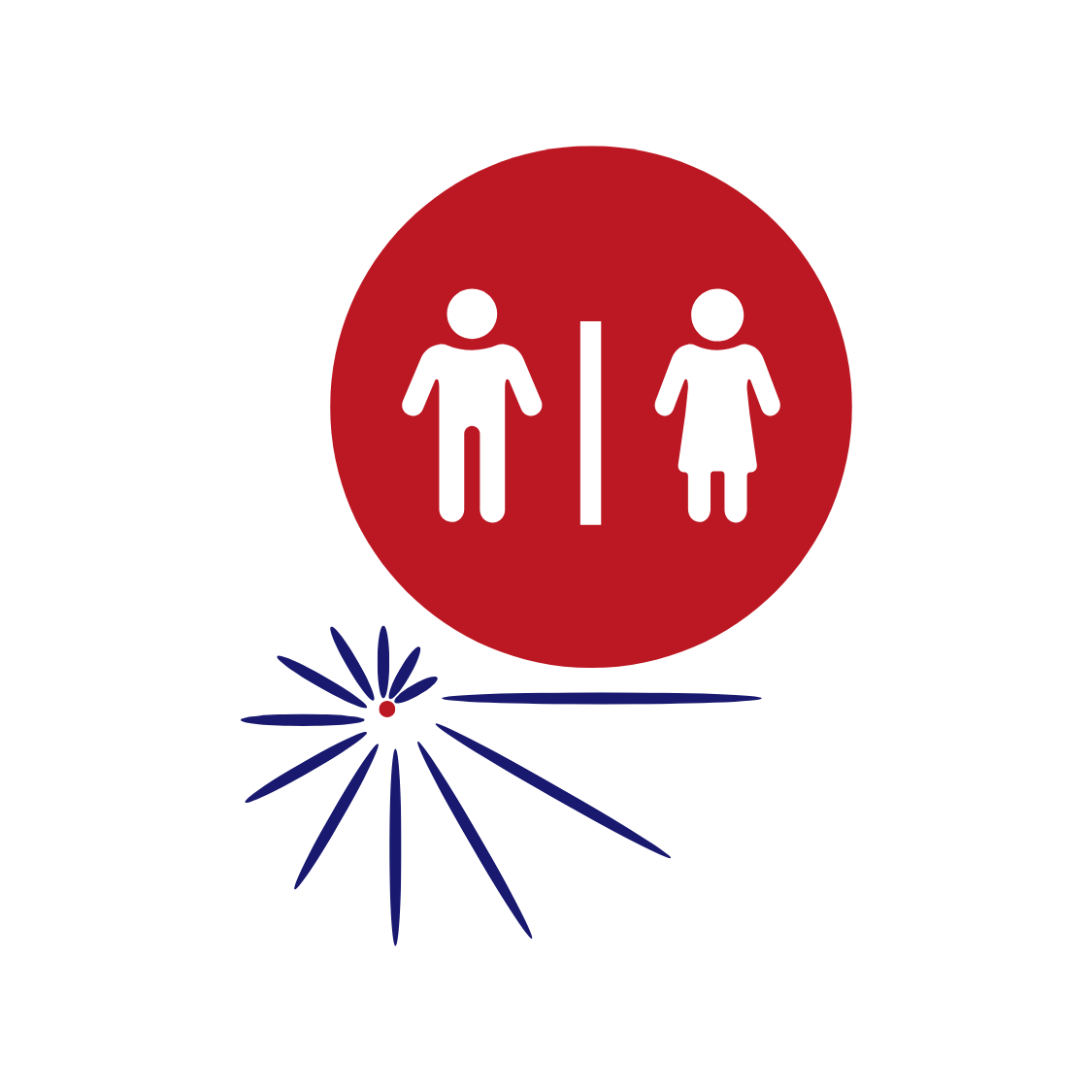
The mark in both orientations, a typographic pairing on Satoshi, mockups, a written rationale, and a set of wayfinding pictograms — sanitation, food, power, crowd — each sitting above the same radiating motif so that the signage and the identity are visibly one system.

// What I did
Mark, pictogram system, rationale and submission sheet.

// What came out of it
Entered in December 2025. It did not win. The part I would still defend is the pictograms: a festival at that scale is navigated by people who cannot read the signs, and an identity that extends into wayfinding is doing more work than one that stops at a logo.
// Where it stands now
Unused. The competition's terms assign the rights in winning entries to the organisers; this was not one, so it sits here instead.
// What I'd do differently now
- I wrote the rationale after the mark rather than alongside it, and it shows: the twelve-year cycle and the two orientations are real, but I found the words for them once the geometry already existed. A reading that arrives afterwards is worth less than one that constrains the drawing.
- The pictograms are the stronger half of the entry and they were the part I spent least time on.