Marks, early
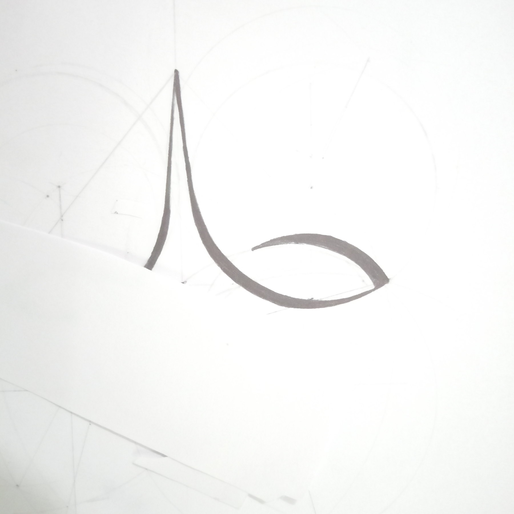
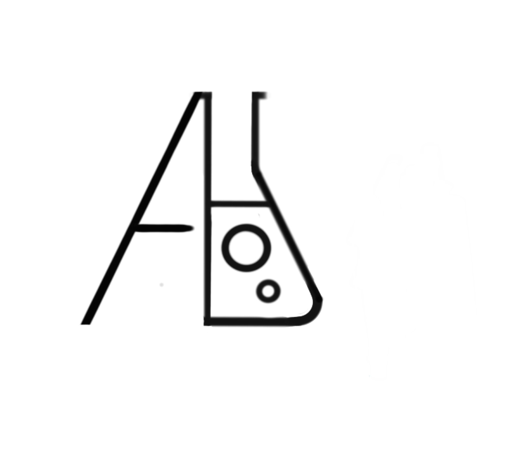
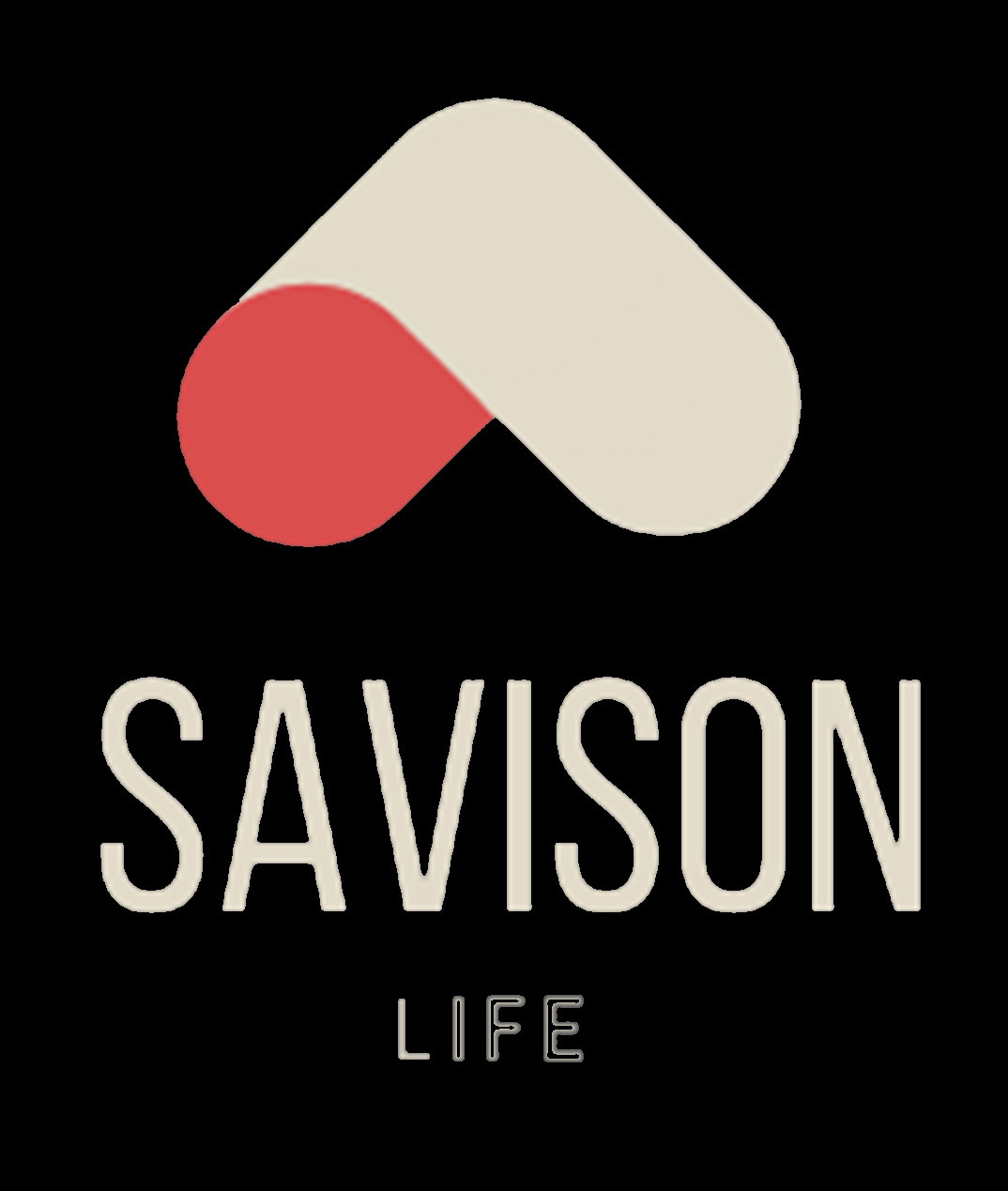
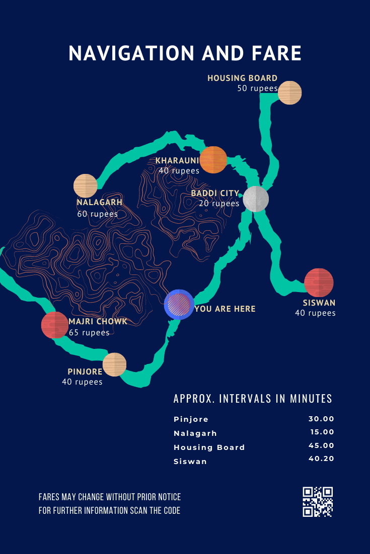
Freelance identity work from before any of the platforms: a retail academy's brandmark developed on paper over successive sheets of construction geometry, a laboratory monogram, a wordmark for the firm that became Savison Life, and a transit map nobody asked for.
// Why this exists
Small jobs taken while still studying, mostly through people who knew people. None of them had a brief longer than a paragraph and none of them had a budget worth negotiating over, which turned out to be the useful part: with nothing to lose there was no reason not to work the mark out properly on paper first.
// What actually happened
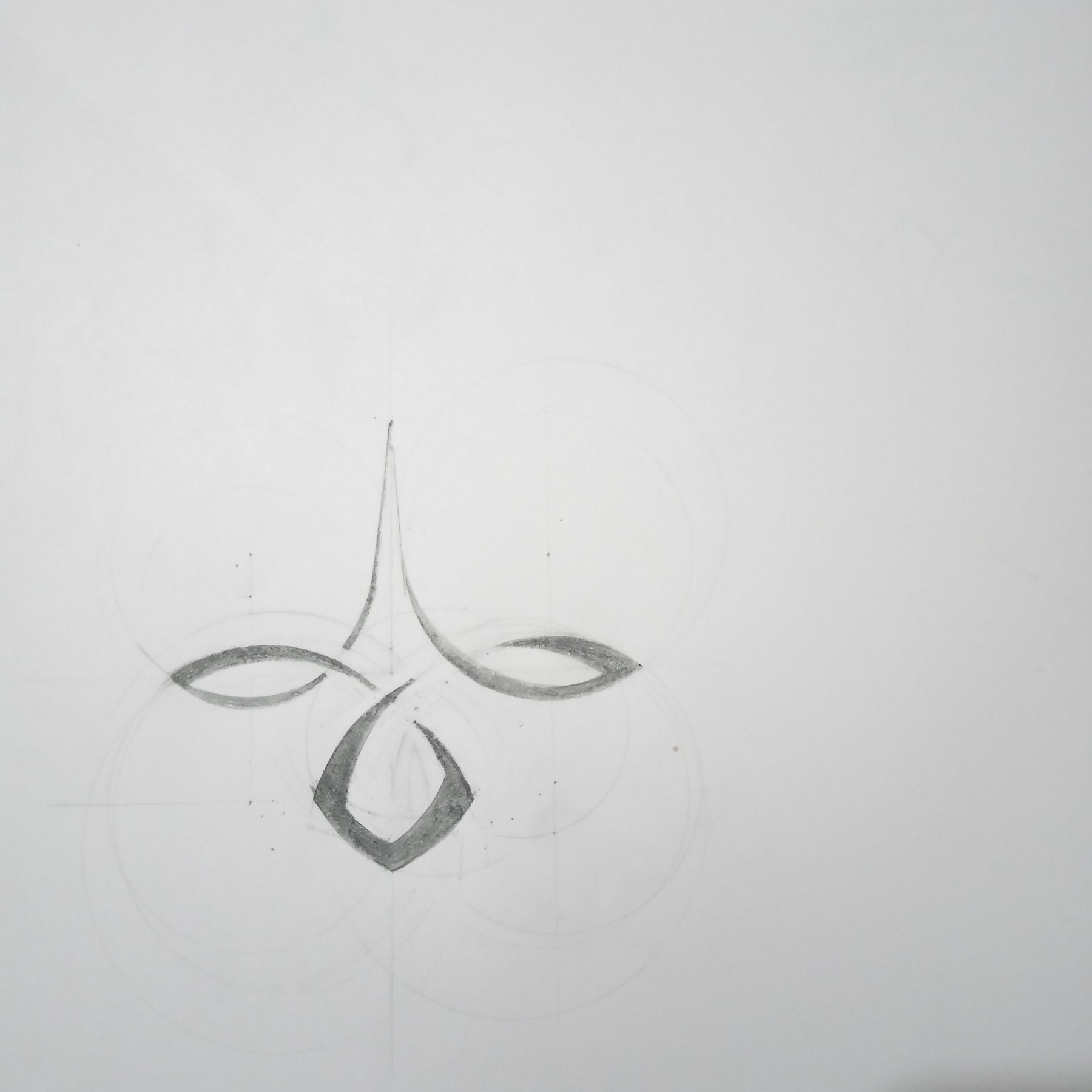
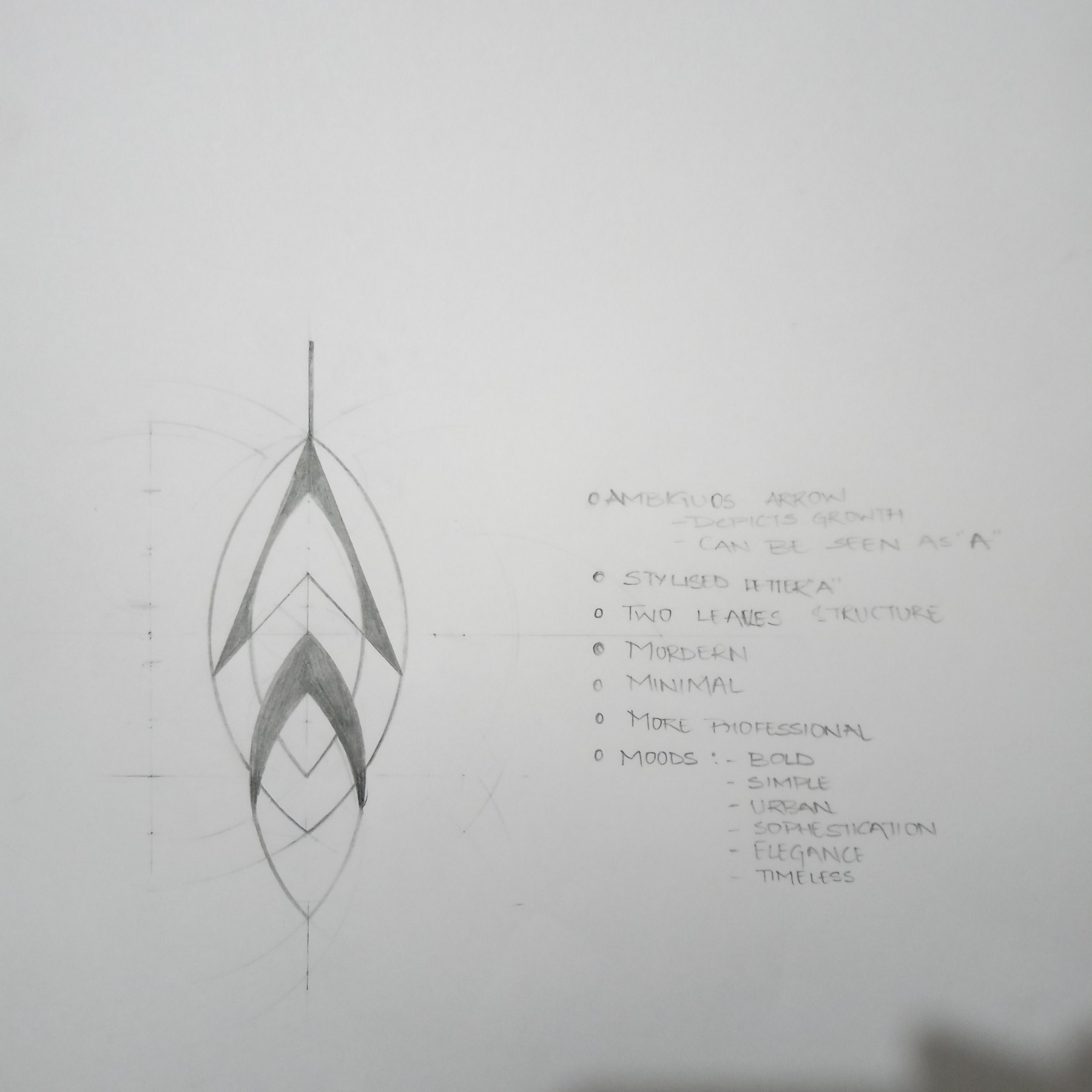
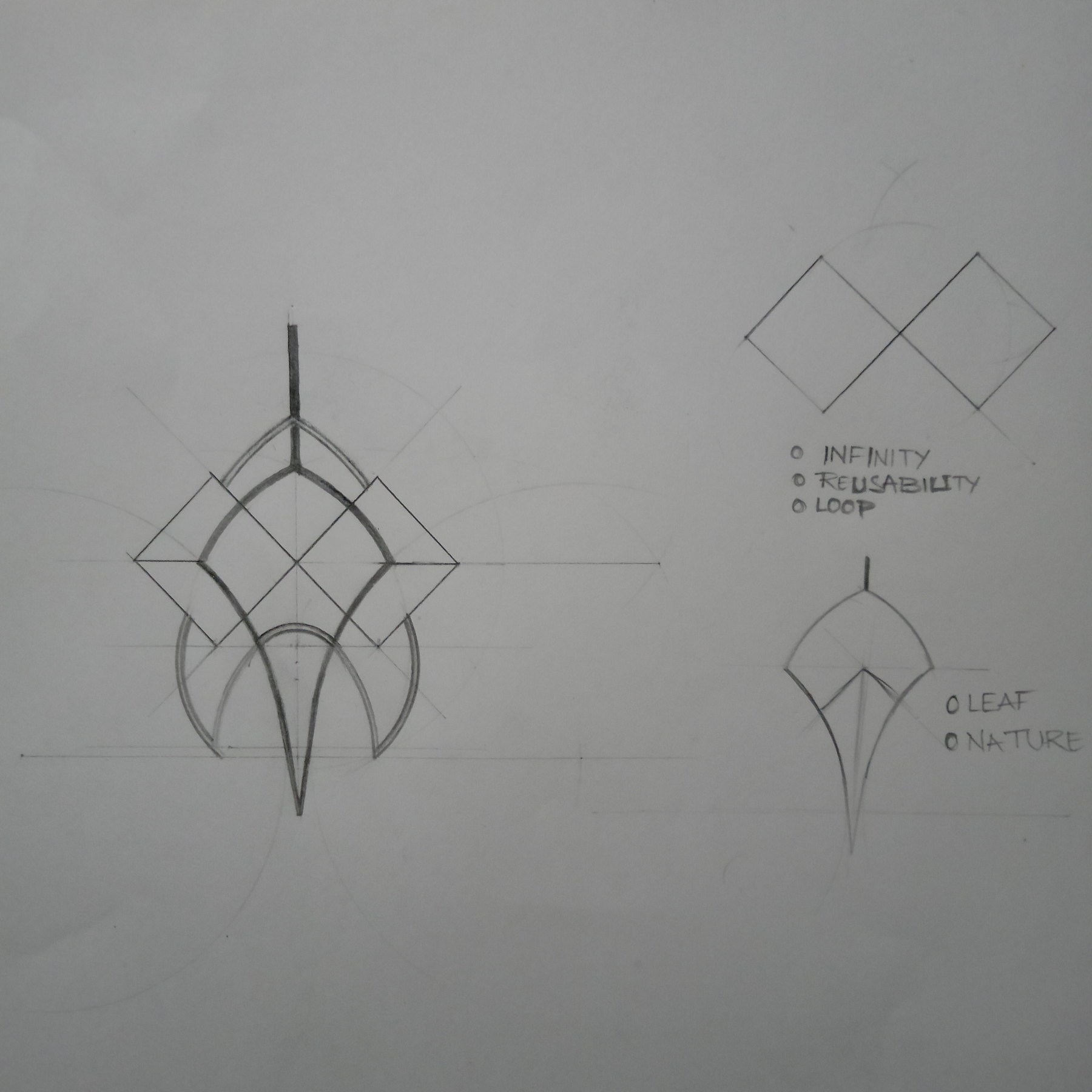
The Accli sheets are the honest record of how a mark gets made. Construction circles and tangent lines first, then the curve tested against them, then keywords written down the side — infinity, traceability, loop, leaf, nature — so each revision has to answer to something other than taste. Two directions ran side by side: one built from natural curves, one from a diamond geometry that stayed more minimal.
// What was delivered
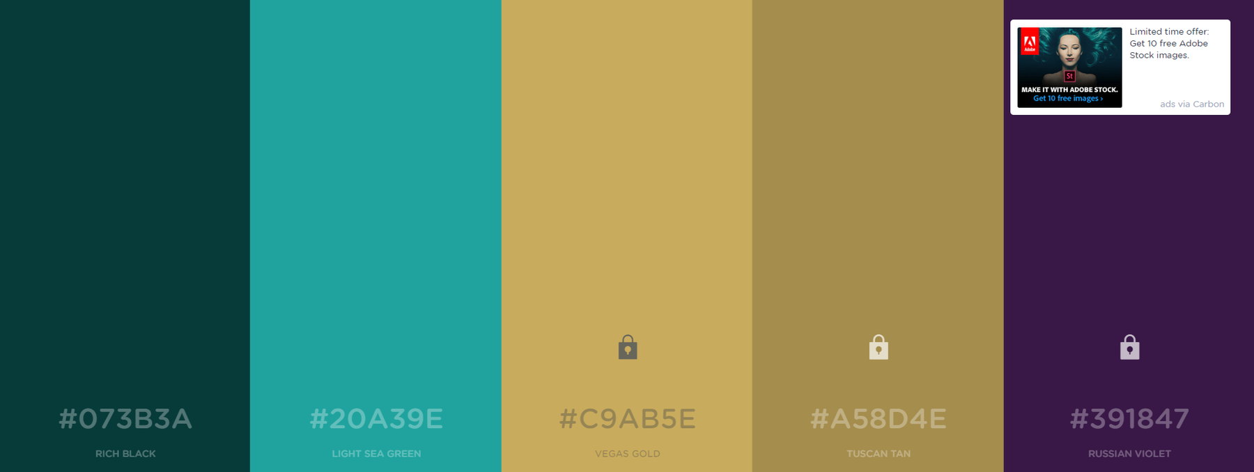
A developed brandmark with its construction drawings, a monogram built from an A and a laboratory flask, a wordmark, a palette with hex values, and a navigation-and-fare map for the Pinjore route.
// What I did
All of it, drawn by me.
// What came out of it
The construction sheets are the thing worth keeping. A mark that was built on a grid can be rebuilt at any size by anyone, and the keywords written beside it mean the next person knows what it was trying to be. Most of the logos I was shown at that age could do neither.
// Where it stands now
Finished and delivered. The marks belong to the people who commissioned them; these are the working drawings behind them.
// What I'd do differently now
- I kept the construction on the sheets because it looked like evidence of effort, and only later worked out that it is the actual deliverable — the one thing that lets somebody else redraw the mark correctly without me.
- Every one of these was priced by somebody who had never bought design before, including me. I had no way to say what the work was worth and no way to say what it did not include, and both gaps cost more than the fee did.