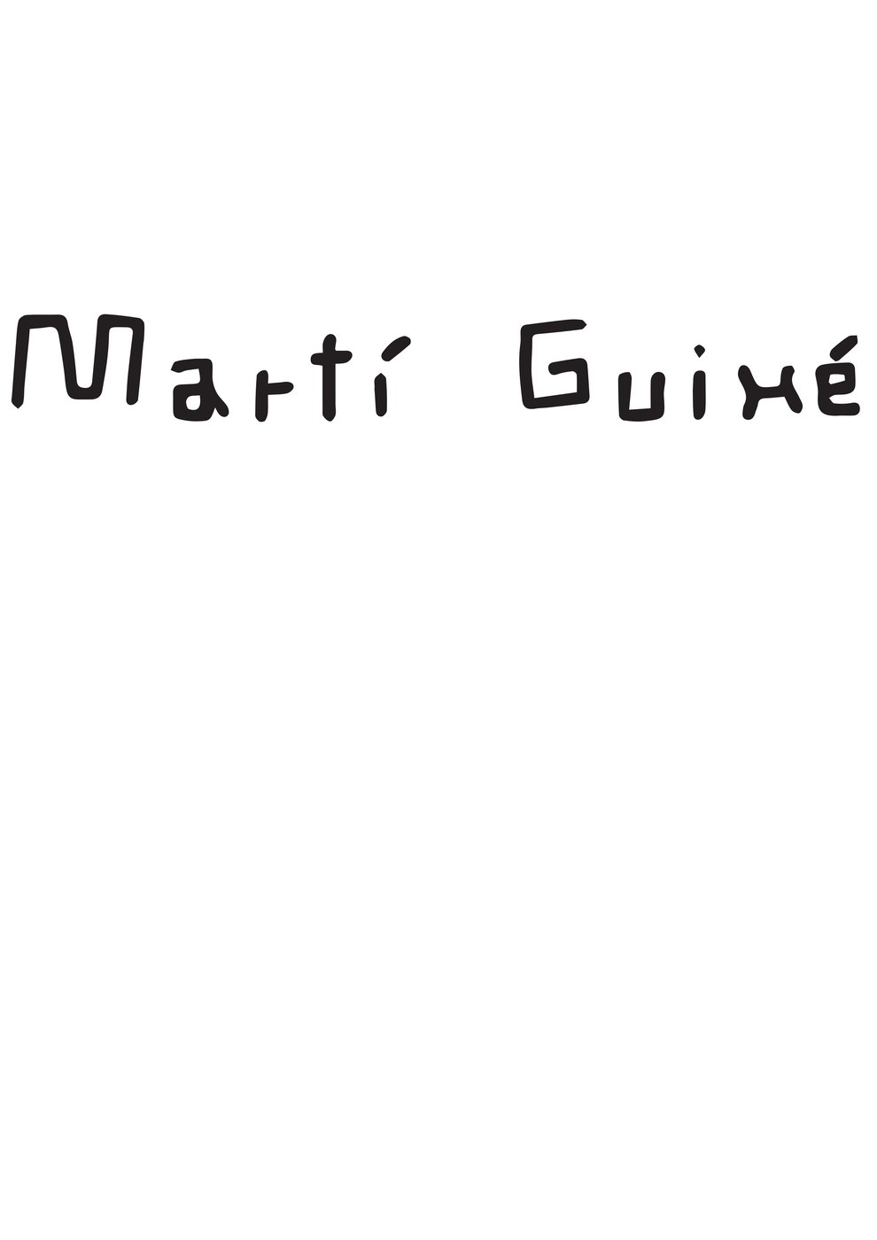
A poster series about a designer who does not make objects
A typographic study of Martí Guixé, whose work is mostly ideas rather than products — which makes him an awkward subject for a poster and therefore a useful one.
A set of posters about Martí Guixé, built around hand-drawn lettering rather than photographs of work. He is a designer whose output is often an instruction, a drawing or a provocation rather than an object, so a poster series that showed products would have been describing the wrong person.
Why it seemed promising
The constraint is the interesting part: you cannot use the usual designer-monograph move of a big clean product shot, because the products are beside the point. What is left is the handwriting, which is how his work actually reaches people.
What was actually built
Five A3 sheets at print resolution, lettered by hand and set up for output.
Why it stopped or changed direction
Submitted and shelved. It was never printed at size, never pinned up outside the studio, and I never asked anyone outside the course whether the lettering read as homage or as imitation.
What survived
That you should describe a practice the way the practice works, not the way a portfolio usually wants it shown. The Rikencare and Betta Beaut identity work both start from that question rather than from a logo.