The identity, written as rules
The identity, written as rules
Paper is reserved for things that are actually paper.
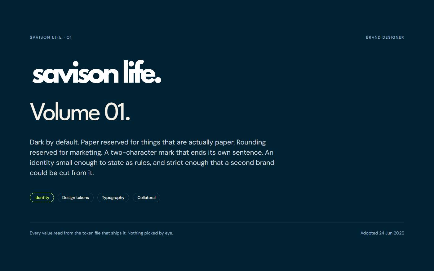
01Cover — Volume 01 — the firm's identity, written as rules rather than taste.Full size ↗ 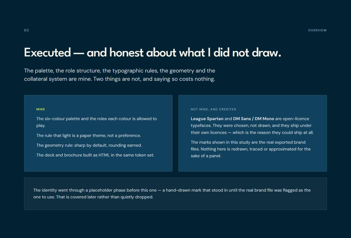
02My relationship to the work — Executed. The identity, the rules and the collateral are mine; the type and the mark have their own provenance.Full size ↗ 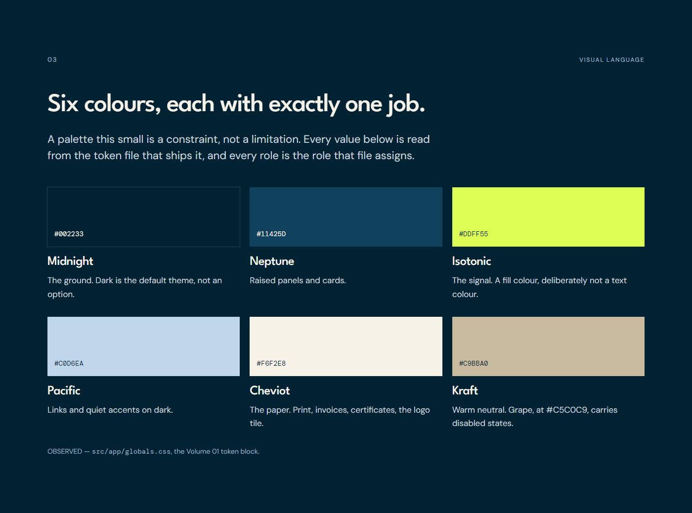
03The palette — Six named colours, each with one job. The names are in the token file, not invented here.Full size ↗ 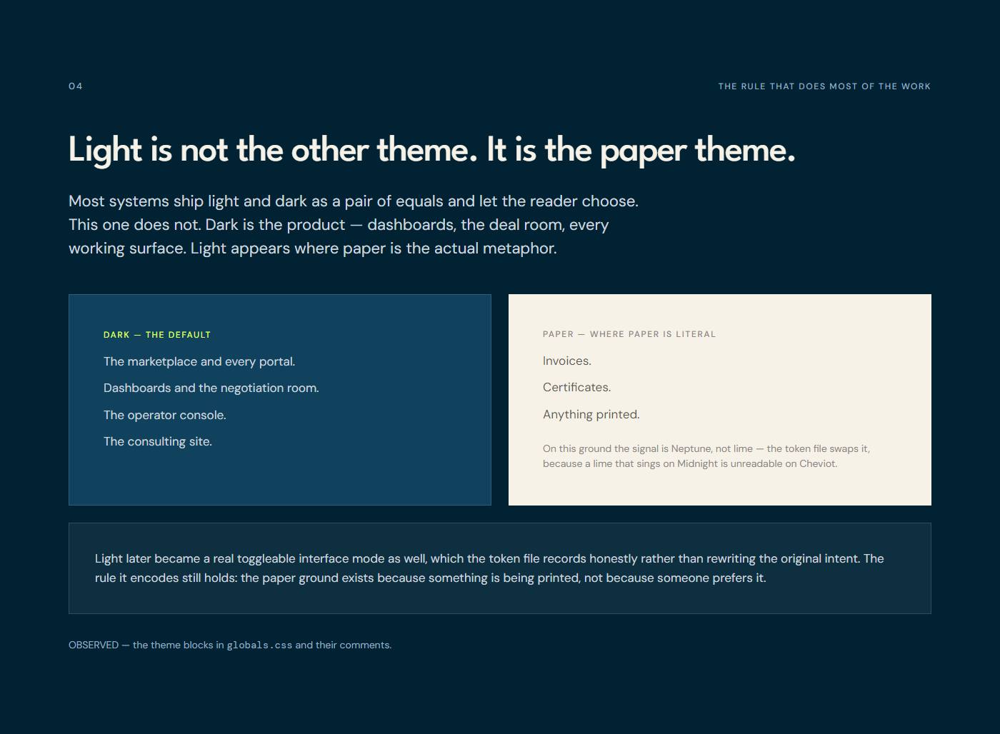
04Paper is for paper — The light theme is not a preference. It is a metaphor, and it is rationed.Full size ↗ 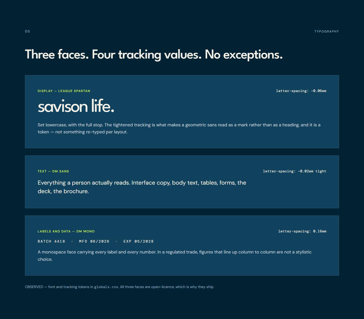
05Type — League Spartan at −0.06em, DM Sans for everything, DM Mono at 0.16em for labels and data.Full size ↗ 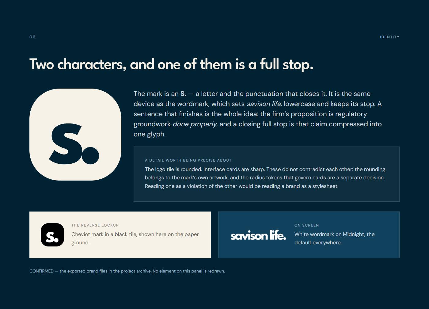
06The mark — The real exported brand files: the S. tile on cheviot, and the lowercase wordmark.Full size ↗ 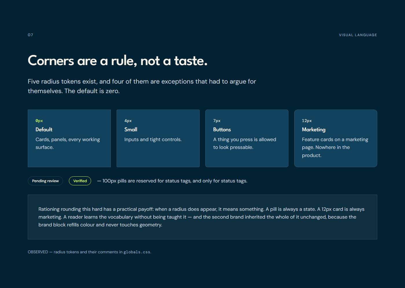
07Geometry — Sharp by default. Every rounding has to say what it is for.Full size ↗ 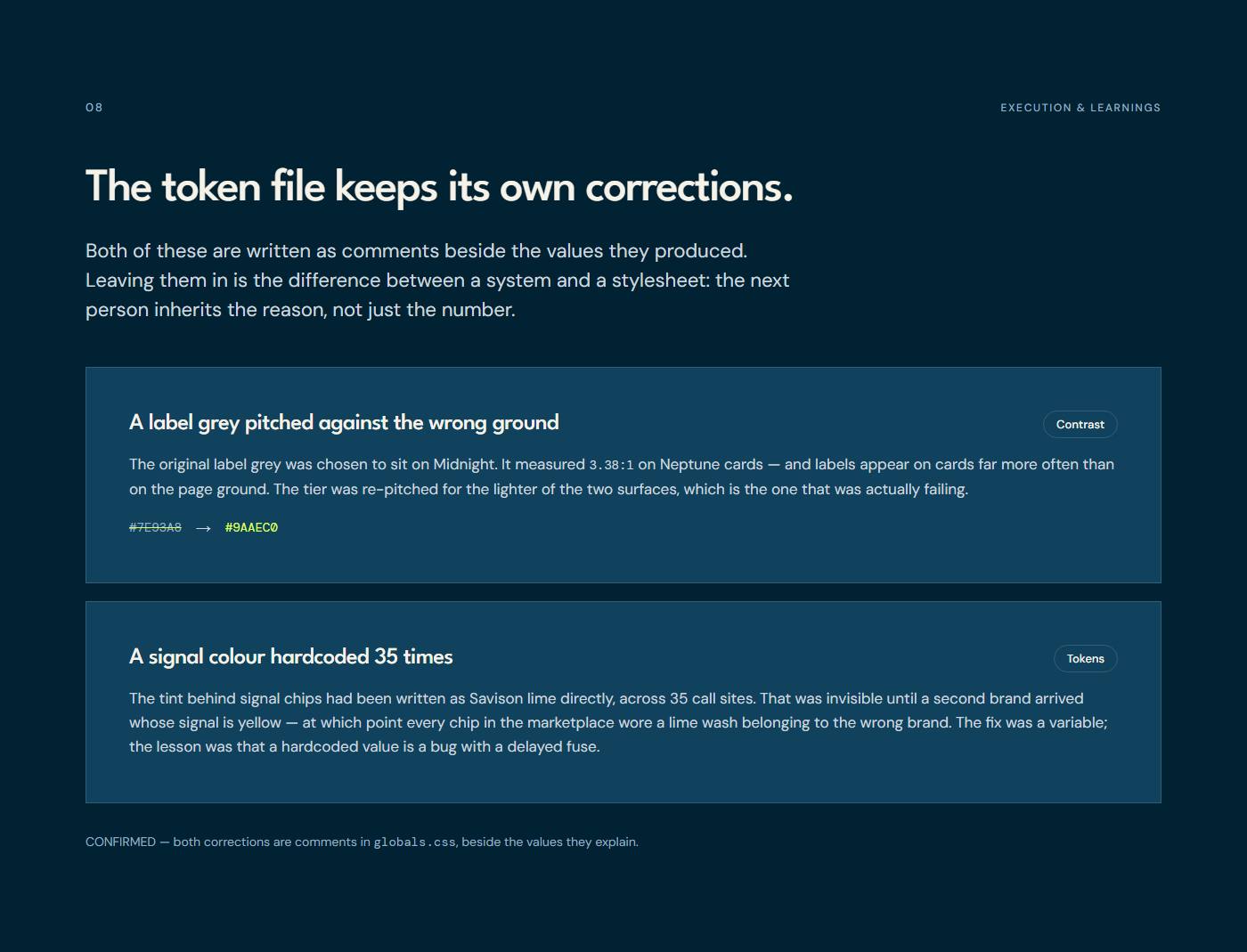
08Corrections kept in the file — Two mistakes documented in the token file itself, next to the values that fixed them.Full size ↗ 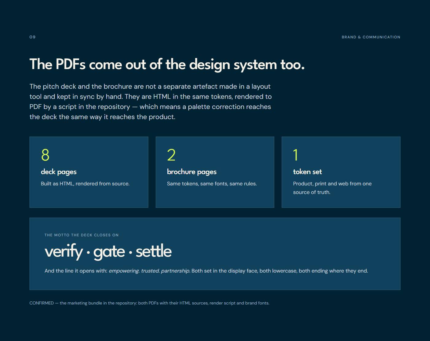
09Collateral from the same tokens — An eight-page pitch deck and a two-page brochure, rendered to PDF from HTML in the token set.Full size ↗ 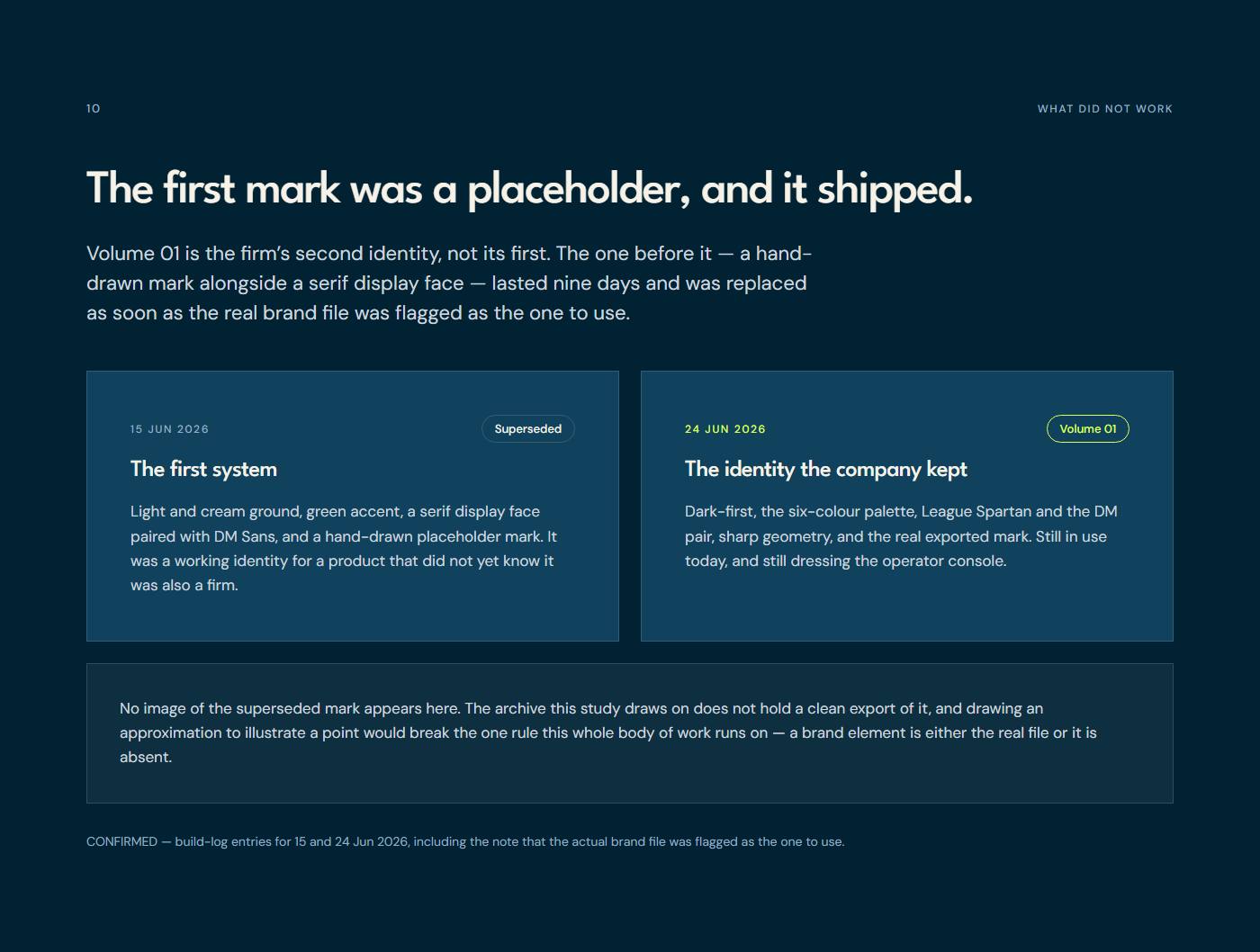
10The placeholder phase — Before Volume 01 there was a hand-drawn mark, corrected within days.Full size ↗ 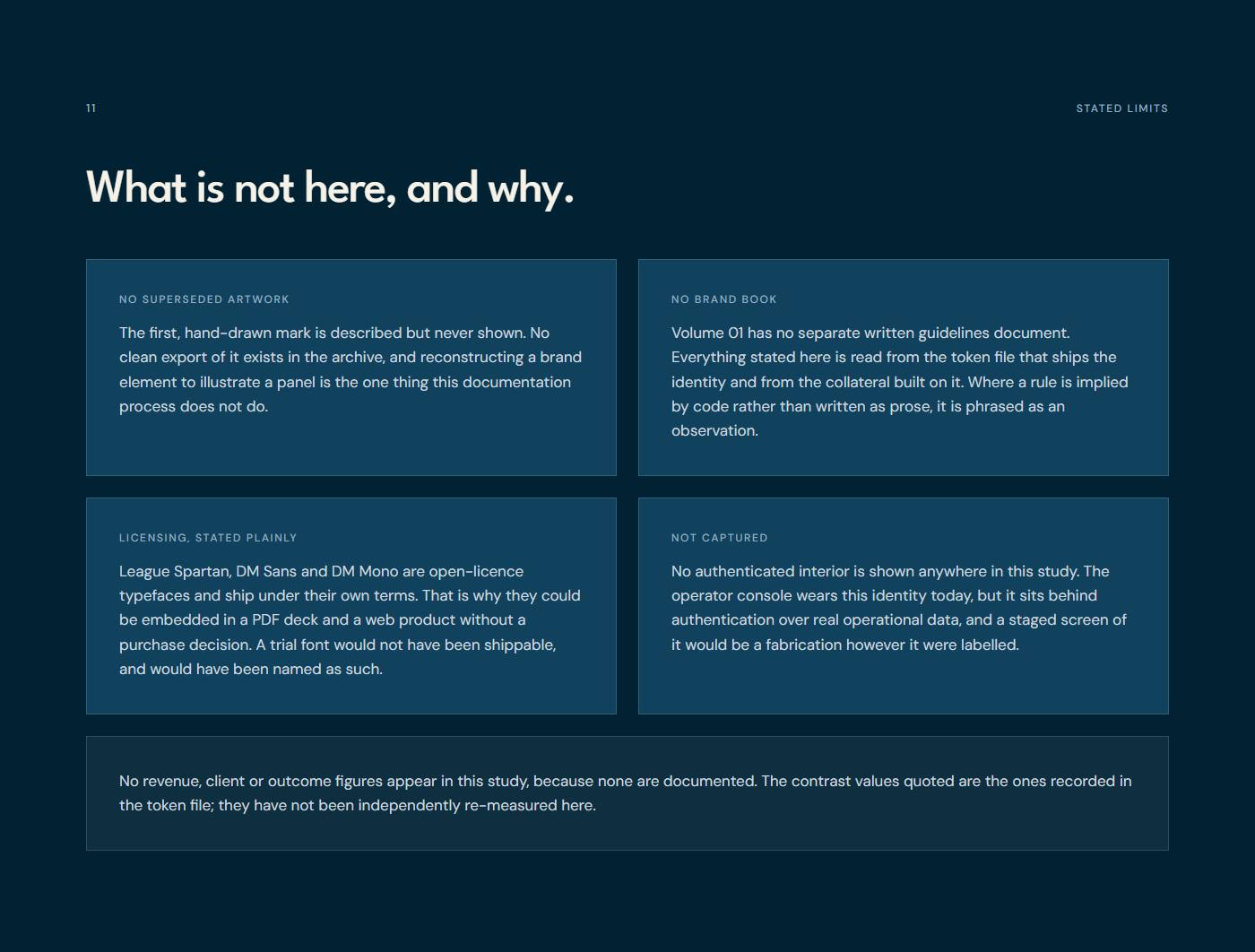
11Stated limits — What this study could not verify, could not show, and deliberately does not claim.Full size ↗ 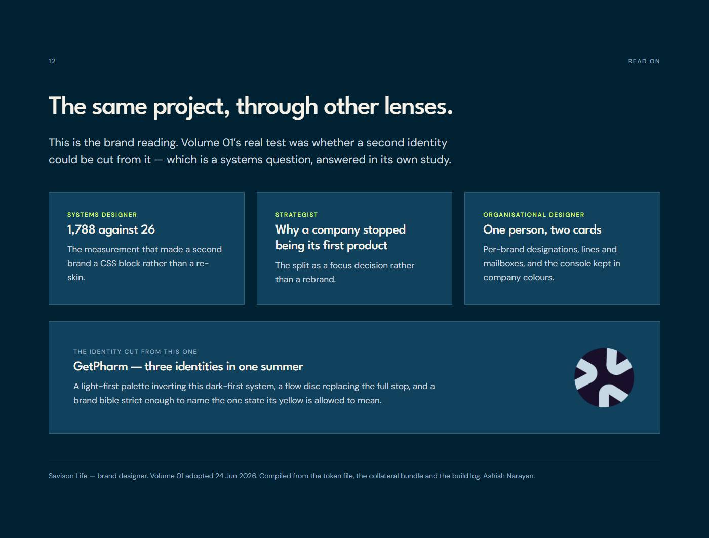
12The rest of this project — The other lenses on Savison Life, and the marketplace it operates.Full size ↗